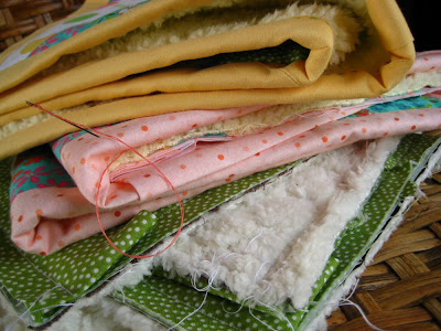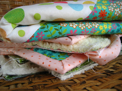
Well it was a pretty productive weekend over here. Moses took nice long naps and Brett was busy working on our house "down-the-hill" (we're renovating a house in San Jose) in the evenings, so I was able to fit in a lot of sewing time. I'll be finishing up 4 or 5 projects this week for posting in the shop. Don't you just love the spring colors?

SO, now I need help from all my lovely blog readers. I am trying to decide whether or not to switch to a more natural background when I photograph my work for posting in the shop. To date I've been photoshopping out the backgrounds of all my pictures so they have a white background. It's a pretty cool look, but I'm wondering if it's a bit too sterile. I find myself more drawn to pictures with natural backgrounds and would love to hear what you think. Below is a picture of a "natural background," and just
click here to see a white background. Which one looks better? Which picture would make you more likely to buy the product? PLEASE let me know what you think; I totally value your opinions! (Oh yes, and remember that everyone who leaves a comment this month is eligible to win
these...) Thanks so much!
 Well it was a pretty productive weekend over here. Moses took nice long naps and Brett was busy working on our house "down-the-hill" (we're renovating a house in San Jose) in the evenings, so I was able to fit in a lot of sewing time. I'll be finishing up 4 or 5 projects this week for posting in the shop. Don't you just love the spring colors?
 SO, now I need help from all my lovely blog readers. I am trying to decide whether or not to switch to a more natural background when I photograph my work for posting in the shop. To date I've been photoshopping out the backgrounds of all my pictures so they have a white background. It's a pretty cool look, but I'm wondering if it's a bit too sterile. I find myself more drawn to pictures with natural backgrounds and would love to hear what you think. Below is a picture of a "natural background," and just click here to see a white background. Which one looks better? Which picture would make you more likely to buy the product? PLEASE let me know what you think; I totally value your opinions! (Oh yes, and remember that everyone who leaves a comment this month is eligible to win these...) Thanks so much!


7 comments:
I'm a big fan of natural backgrounds. The white looks ok. But I like fun backgrounds that don't blend in with the product too much.
I like the white, I think. I think it's easier to look professional with the white backgrounds. That being said, I like the natural background you've chosen.
sorry! Also, with an all-white background, your product has a chance of appearing at the very top of the front page of Etsy (check it out---there are several small items to the right of the "all things handmade" text). Only product photos with white backgrounds appear there.
I'm going to restate my opinion on your blog too! Look at those pictures!! You are blessed with incredible natural lighting and a great eye! There are some "natural backgrounds" on Etsy that would ABSOLUTELY benefit from changing to white, but not these...they are awesome pics!!
Geesh, really tough call! The natural here looks wonderful, but maybe the white across the board? I think you can easily pull off either.
I prefer the white background. Everything else takes away from the item.
Love your shop,
Ana
Thanks so much for all the input everyone! I've decided to stick with the white backgrounds for now - some ipctures look great with the natural background, but others get lost in it. I REALLY appreciate everyone's input - it totally helped!!!
Post a Comment